Airbnb is one of the leading websites that have taken advantage of the UX (user experience) design strategy. The company was valued at $113 billion in 2021. Read along to learn how Airbnb drives user action with its UX design strategy.
How Airbnb Continues to Attract and Retain Millions of Users
Truth be told. Many users don’t know or aren’t familiar with Airbnb’s competitors. This renting/booking marketplace was established in 2008 and has revolutionized the travel industry.
For a business that has been around for 14 years, it shocks many how it continues to grow at a pace that other businesses can only think of.
How do you continue to attract and retain millions of users? Better yet, how do you convince people to welcome guests into their homes and stay for days? Lastly, how do you ensure that the guests are happy to rent the spaces in the future? This post aims to provide answers to these questions.
Airbnb Website
The greatest winning point of Airbnb is its website. To be specific, the main things that make Airbnb’s website unique and outstanding are that it is:
- User-friendly
- Visual
- Personalized
Upon checking the Airbnb website, you realize that it doesn’t have overwhelming images even though it deals with travel.
It has a simple layout and great functionality that is easy to use. This high level of great user experience is what has made Airbnb exceptionally successful.
Another thing that makes Airbnb’s website stand out from the rest is personalization.
The use of personalization helps Airbnb provide a better user experience to its users, which is key to business growth.
Let’s look at the homepage and product pages to understand Airbnb’s website better.
Airbnb’s Homepage
Like any other website, the homepage is the main webpage of Airbnb’s website; this is where personalization has the most impact.
The Form
To provide a personalized experience, Airbnb uses the booking to get information about the users and what they’re looking for. This explains why their booking form stands out the most.
The form is simple and captures crucial information that can be used to personalize the experience for the user. This information can include the location you’re headed to, the date you’re going, and who will accompany you.
It comes with a CTA header (call to action) that states what the website does: book unique homes and experiences.
Yes, no matter their budget, travelers go to Airbnb to look for a unique property that matches their requirements and preferences.
Navigation Bar
Easy navigation is key to any website, and Airbnb takes it seriously.
To improve user experience and provide a better supply of property, Airbnb has taken measures to ensure that hosts can easily navigate the site to get where they want hassle-free.
Visuals
Airbnb selects its images carefully to ensure they’re unique and gives a ‘home’ experience. They choose the location pretty well to provide a feeling of adventure. It also has a clear navigation bar at the top—their images look great and don’t affect the website’s functionality.
Property/Product Page
Since Airbnb promotes properties and hosts, it makes sense to look at their property page. Like any business that sells tangible products, Airbnb knows that good photographs are vital.
Besides the images, the property sections provide vital information users would like to know about the property, including the location, price, number of bathrooms, etc.
The best part is that the booking form is always visible when scrolling down the page.
That means the user can easily take the required steps when they see the property that matches their preference. Moreover, the form is simple, and a copy below gives insights into what will happen when you fill out the form.
Airbnb requires the hosts to provide information about the property. Of course, Airbnb provides the structure to ensure all crucial details are covered, including:
- Space information
- Guest access
- FAQs
- Other things to note
If a user needs more information, they can get it by contacting the host.
Reviews
Airbnb does exceptionally well in reviews.
No matter the industry, any online business needs some level of social proof on its site to make it easier to win more customers. This is where the review section comes into play.
The review section allows Airbnb users to see reviews that customers have left after using their property.
There’s also information about the host because some travelers would like to see information about the host before they book property on the page.
Some of the information you get in this section include:
- Whether the hosts are verified
- How long they have been using Airbnb
- The number of reviews they’ve received
- How often do they respond to customer queries?
This information gives the user confidence and reduces inconveniences when booking a property.
Neighborhood Guide
Airbnb also provides information about the location of the property, which is helpful for users who aren’t familiar with their destination.
Of course, many users research this information in advance but displaying it is still worth it. Having this content on its site proves that Airbnb is committed to providing a better experience to its users.
Other Airbnb principles that boost conversions include:
Commitment and Consistency

This principle implies that when we commit to something, we feel the push and urge to be consistent with that decision. This concept isn’t new.
A good example is when businesses run a contest asking customers to highlight why they use a particular product and then reward the winning entry.
While it may seem like a normal contest, it has a huge physiological impact on the participants as they’re more likely to choose the product in the future.
Airbnb uses this technique creatively to win users.
A good example is the Airbnb Superhost, where the best host (highly rated) qualifies for the Superhost tag on meeting certain requirements, including:
- Completed a minimum of 10 trips
- Maintained at least a 90 percent response rate
- Maintained a 50 percent review rate or higher
- Have a 4.8 overall rating
- 0 cancellations with exceptions of those under Airbnb Extenuating Circumstances policy
As you can see, Airbnb Superhost has much to do with commitment.
Another example is the Response Rate and Response Time.
Ideally, once a host achieves a response of 100 percent and replies within an hour, they need to maintain that level of commitment, no matter the challenges.
Lastly, on Commitment and Consistency is the Availability Calendar. Users are more inclined to select a house where the schedule is updated daily than one that goes days without updating—a sign of commitment and consistency.
Authority
Humans are more likely to say ‘yes’ to other people if they view them as having higher authority. This can be in information, power, knowledge, and other metrics people apply when making a decision.
Businesses, too, use this principle to influence customer decisions. They achieve this through initiatives like partnering with other organizations, quoting experts, highlighting their awards, etc.
Despite its growth, Airbnb can still benefit from the Authority principle to increase its market share currently held by hotel chains.
One way they can achieve this is by providing a reliable experience without compromising comfort and quality to compete effectively with hotel chains.
To achieve this, Airbnb has introduced Airbnb Plus—a list of homes verified by Airbnb in different cities to meet the quality and comfort set by Airbnb.
The selection and verification come with authority and will give users more confidence knowing that the property they book meets the expectations Airbnb has set for hosts and guests.
Urgency
Another principle that Airbnb uses well to increase conversions is urgency. With this tactic, Airbnb applies measures to push the customer to decide whether to make a booking.
For example, when looking for a place to stay in their ideal location, Airbnb may warn customers that only 10 percent of homes are left. Therefore, a user needs to make a booking to secure a booking—urgency.
But urgency shouldn’t be overused because customers may become aware of the trick and ignore the message.
It should provide valuable information about the property the user is considering booking.
User Control and Freedom
It is not uncommon for users to choose a system function by mistake and will require an exit or a way to leave the unwanted state. A site must support the undo and redo options in such a case.
Airbnb understands this and allows users to view different products at a time by opening a new window for each property without closing the previously opened product.
However, their product page doesn’t allow users to navigate back to the original state.
If users exit the original search page, they can find their way back by clicking the Airbnb logo at the top left corner. However, this will clear search info which could be frustrating.
Recognition over Recall
You can ease the user’s memory load by making actions and options visible.
This way, the user doesn’t have to remember information from a specific dialogue box but rather the instructions are visible or easy to retrieve when needed.
Airbnb users might open several destinations in one session for different dates.
To make it easier for users to choose between different potential destinations, Airbnb saves all searches in the search bar, including the number of guests and date ranges.
This reduces the need for users to remember everything, especially if they’re back on the page after a couple of days or weeks from the last search.
Flexibility and Efficiency
This principle allows users to tailor frequent users according to their experience. For Airbnb, existing and new users get a totally different homepage display experience when navigating the site.
The new user is displayed a less-cluttered landing page where Airbnb’s value crop orients them to understand the website better.
On the other hand, the landing experience for previous visitors is more content-heavier since the user already understands how the company works.
This experience enables them to start searching immediately.
Wrapping Up
A well-designed website should be easy to use and have clear steps that guide users in what steps to take to get what they’re looking for.
Airbnb prioritizes usability to ensure they provide users with a good user experience by ensuring a product’s behavior is predictable, expected, and usable.
This is something that other companies can get inspiration from and apply at every stage of their user experience and brand building processes.
Suggested

Revenue First SEO
The New SEO Approach for Ecommerce Growth Rising CPCs. Saturated ad platforms. Customer acquisition costs climbing quarter after quarter. For ecommerce and B2B brands, the math on paid media keeps getting harder. And the question more marketing leaders are asking: where does organic search fit into a sustainable growth strategy? Our Founder & CEO addressed many of these questions
February 24, 2026

HubSpot TripleSeat Integration
HubSpot TripleSeat integration solves a major problem for event venues and hospitality businesses. Most companies lose track of where their leads come from when forms bypass their marketing system, or they lose track of invoices and sales pipeline when sales tools are siloed. This breaks the connection between ad spend and actual bookings. The result? Wasted marketing budgets and poor
February 23, 2026
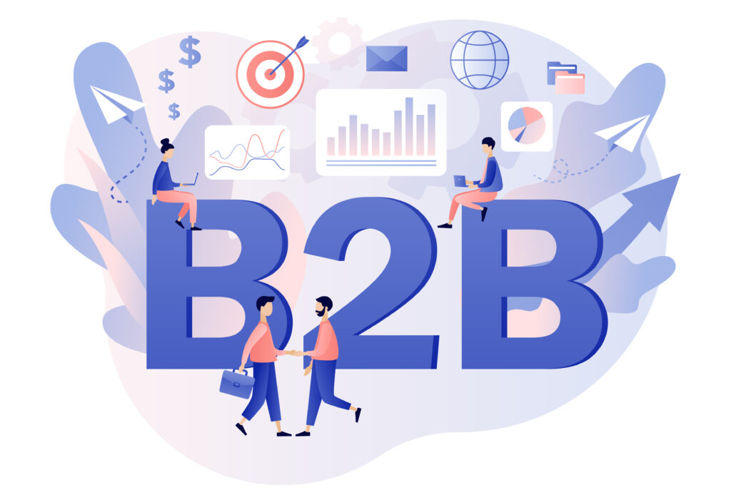
B2B Facebook Ads: Ultimate Marketing Strategy
Despite Facebook’s popularity as one of the best advertising platforms, many B2B businesses still hold back from advertising on Facebook. According to Statista, 91% of B2C marketers run Facebook ads, while 86% of B2B marketers use LinkedIn. This post will examine why some B2B marketers avoid Facebook ads, their effectiveness, and how to create winning B2B Facebook ads. An Overview
February 23, 2026
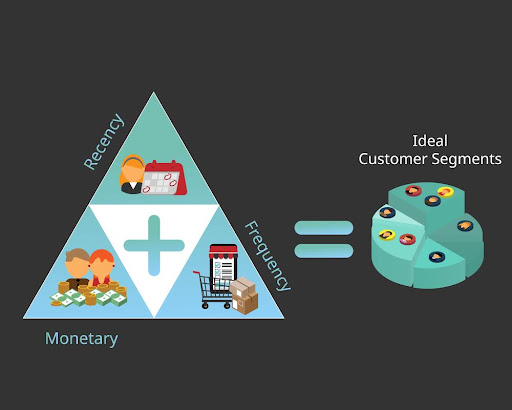
How To Create Win Back Customer Segments in Shopify
Here’s the thing about ecommerce: you spend a fortune acquiring customers, and then they ghost you. No explanation. No goodbye. Just radio silence. The good news? Most haven’t sworn off your brand forever. They’re just distracted. And bringing them back costs way less than finding new customers (we’re talking 5x cheaper). This guide shows you exactly how to create win-back
February 23, 2026

Query Fan Out for GEO: AI-First Search Optimization
Query fan out drives significant improvements in search visibility for businesses that implement it correctly. This AI search technique expands single queries into 5-15 related searches behind the scenes. Traditional SEO targets individual keywords. Smart businesses now dominate entire topic clusters through query fan-out tactics. This guide shows you the exact methods we use to help clients capture traffic they
February 23, 2026
Contact us
We value your privacy and won't share your email with others.
We'll only contact you with curated content.