On May 1, 2021, Google will launch a new algorithm update that will include a factor called Page Experience in their rankings. In line with this, Google has launched Web Vitals, essential metrics used to measure and improve user experience on the web.
This article shall give a detailed guide on search signals for page experience and Core Web Vitals to help you prepare for Google’s Page Experience Update 2021.
What’s the Page Experience Update?
According to Google, page experience refers to the experience of users when interacting with a web page. Optimizing your page for these factors will give users an easy time browsing through web browsers and surfaces, including mobile.
In the end, this will boost the success of your business as more users will interact with your site with ease.
In other words, Google wants to ensure that the sites that rank at the top of SERP have a good user experience.
That means sites with user-friendly experience will rank higher than those that don’t when this update comes into place.
Why this Page Experience Update Matters?
It is not the first time Google is releasing updates. They have done this all the time, and if you are like many website owners, you may be wondering why this update is essential.
For starters, it is essential to note that user experience affects the ranking of your page indirectly. After all, if visitors have an unpleasant experience when reading or viewing your page, the chances are they will leave your site immediately and head to another site.
According to this update, Google will use the new user experience signals to determine what websites will rank on top.
This latest Google update is about user experience – it is about bringing people more of what they love when they do a Google search.
Of course, you need to pay more attention to keywords and backlinks, but seeing the emphasis given on user experience, you must give this update the seriousness it deserves. If anything, Google is likely to release more updates based on user experience in the future.
What Determines User Experience?
Google relies on ranking signals to determine the user experience of your web page. These ranking signals determine whether a page is relevant to a user’s needs and is an indicator of page experience.
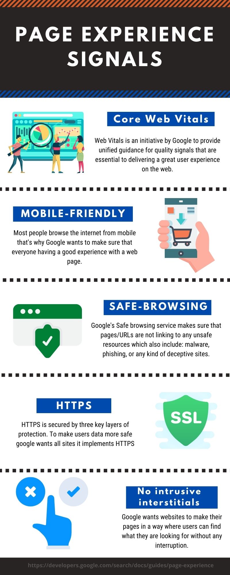
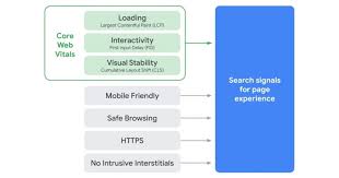
Starting May 2021, Core Web Vitals (will look at this in detail later in the post) will form the new page experience signal. The following are the search signals for page experience:
Page Experience Signals – Mobile-Friendliness
Mobile devices have become increasingly popular in the last decade. Statistics show that more than 27 percent of the traffic that a website receives comes from mobile devices. Mobile users are increasing every day, and websites need to make their sites mobile-friendly to target this group.
Why It’s Important to Make Your Site Mobile-Friendly?
Having a mobile version of your website is a pivotal aspect of making your site user-friendly. Google launched a mobile-friendly algorithm aimed at rewarding mobile-friendly pages in the mobile search results.
However, having a mobile-friendly website is not enough – you must ensure that users have a good user experience when browsing your site on mobile devices as they would on desktops. After all, a site that has been squeezed to fit into a mobile device will turn visitors away.
Having a mobile-friendly website ensures that visitors can comfortably browse your website on other devices than desktops.
Many factors go into creating a mobile-friendly website, including:
- Ensuring the size of the text can be viewed on mobile devices
- Use of mobile-compatible plugins
- Making your webpage fit in various screen sizes
- Ensuring mobile users can click on links and buttons
- Ensuring your webpages are loading faster
How to Make Your Site Mobile-Friendly to Improve User Experience?
There is no one-fits-all when it comes to making your site mobile-friendly. That’s why you need the help of a good digital marketing company like AlchemyLeads to help create an effective mobile strategy for your site.
Below are the steps to make your website mobile-friendly:
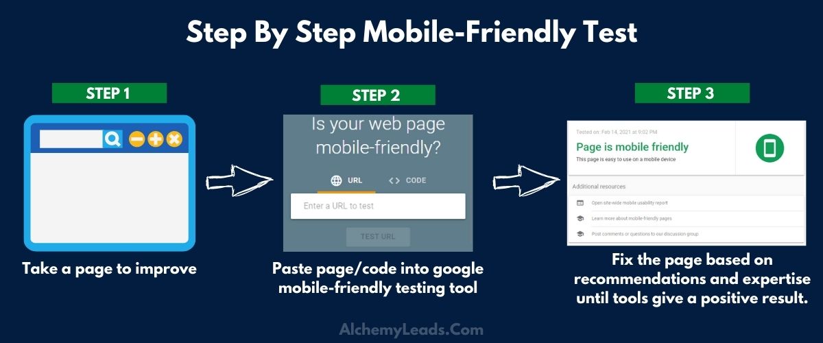
Take the Mobile-Friendly Test
Before you hire a professional to help make your site mobile-friendly, you must first test your current site. The results you get from the mobile-friendly test will determine the next course of action.
Learn the Basics of Best Mobile Friendly Practices
Implementing a mobile-friendly strategy is not like dancing at a birthday party. It requires in-depth research into the best mobile-friendly practices.
Having SEO professionals on your side will help you make more informed choices. According to Google, here are three best ways to implement your mobile strategy:
Responsive Web Design
Responsive Web Design uses the same HTML code and URL regardless of whether you are using a mobile, desktop, tablet, or non-visual browser. The best thing is that it will give a different display based on your screen size.
Responsive Web Design is best to use as its design pattern is easy to use and maintain.
Dynamic Serving
Like Responsive Web Design, Dynamic serving uses the same URL in all devices. However, it generates a different HTML for each type of device in line with the user’s browser.
Separate URLs
Separate URLs serve a different code and separate URLs for each device. It will use the user’s device to redirect them to the appropriate pages using the HTTP and Vary HTTP header.
According to Google, all these URLs are good, but you must ensure that all Googlebot user agents can access the pages.
Main Things to Keep in Mind When Going Mobile
Google ranks websites based on your mobile content, relevance, and user experience.
Therefore, you must make your mobile navigation work for users and SEO. That way, users can navigate through your website easily without issues like low page speed or cluttering the screen. To that end, here are the best steps to improve the user experience for mobile users:
Keep Navigation Short
It’s imperative to remember that you are seasoning for a small screen size for mobile navigation. As such, you need to make it short.
Among other things, make short labels and limit your mobile menus. Avoid any navigation that is not relevant for mobile devices and includes only links that help users complete vital tasks.
Give Priority to Important Pages
Your visitors are busy people, and it’s only fair that you help them get what they are looking for quickly. Ask yourself the following questions:
- What are priority auctions for mobile visitors on your site?
- What are your priority pages?
- What are your category pages?
- What pages are best for mobile users?
The answers you give to these questions will help determine what pages to list in your main menu and the links and call to action to include on each page.
Users and search engines will love mobile navigation that is short and sweet. A page’s load speed is among the things that will determine Google search ranking and makes for a better user experience.
View Search as Navigation
Mobile users don’t want to navigate through menus when looking for something. That’s why you should provide a “Search Box” at the top of your mobile view to help users find what they need quickly.
Be Creative About Fonts and Contrast
Tiny texts that require zooming to read creates a bad user experience for your users and Google. Ensure that the text on your mobile website is visible on various devices without zooming.
You should especially consider this when creating your mobile-friendly CSS to control how the text appears on various devices. Also, ensure there’s enough contrast between the text and its background.
Design Your Website for Touch
We are in the digital age, and most people are using smartphones and tablets when browsing websites. Therefore, it’s advisable to design your website for touch to make it easier for smartphone users to get around your website.
For a better user experience, set a minimum touch target (about 48 pixels). Not all people can hit the tap mark easily, so consider incorporating touch feedback in your navigation. It can be a font change, color change, or any other visual clue.
You can also include navigation that uses images and graphic buttons to direct visitors. However, you should use graphic buttons to supplement toggles or static navigations.
Optimize Your Images
Large-sized images can be detrimental to your mobile experience. Images that take too long to load will increase your page load time. Google will give priority to webpages on mobile that load quickly than those that load slowly.
According to Google, users searching for images from mobile are more than those on desktops. That’s why you need to optimize your images for mobile.
For a better mobile experience, upload only the best image size or file types. You can also opt to remove certain images from the mobile version of your site.
Page Experience Signals – Safe Browsing
Reports of hacking are not uncommon today. If you are like most internet users, you would not want to visit a website that would put your devices at risk. That being the case, you need to take every measure to ensure that Google does not blacklist your website as an insecure website.
Google warns Chrome users (the most common browser on the web) against visiting an insecure website.
You might have heard about the ratifications of search traffic, HTTPS, and SSL certificates. These are essential things to think about if you care about your web experience with your visitors and your ranking in search results.
What is Safe Browsing and Why Does it Matter?
Safe Browsing is a service launched in 2007 and is designed to protect website owners and visitors from dangerous websites. When you click harmful content, Google sends an alert warning you of the same. This can be on numerous platforms, including:
- Gmail
- Google Search
- Google Chrome
- Google Ads
- Android Ads
- Other Browsers
Google identifies sites that might be trying to phish users or install malware. Safe Browsing identifies, analyzes, and keeps up-to-date Safe Browsing information. Safe Browsing protects website owners and users from:
- Malware
- Unwanted software
- Social engineering content
Tips to Keep Your Website Safe
Here are steps to take to keep your website safe:
Sign Up for a Search Console Account
Google Search Console is a reliable tool to check whether your website has been compromised. Google Search Console is free software that will give you security information about your website.
These notifications will help protect your website against infections (at least 62 percent).
Implement HTTPS
HTTPS is an excellent way to be secure on the internet. HTTPS secures your website by ensuring that users are interacting with the correct server.
The use of HTTPS is highly recommended when delivering anything private to your users. Besides, Google has indicated that using HTTPS will boost your search rankings.
If you are using HTTPS, consider setting up HTTP Strict Transport Security (HSTS) to protect your entire domain from insecure HTTP.
Ensure All Software is Up to Date
Keeping all your software up to date is key to securing your website. This is important to your server operating system, CMS, or any other software you run on your website.
If you rely on a managed hosting solution, the hosting company will take care of the operating system’s security updates. On the other hand, you must be swift to apply any security patches if you are using third-party software on your website.
Page Experience Signals – HTTPS
Implementing HTTPS is an excellent way to prepare for Google’s page experience update slated for May this year.
HTTPS (hypertext transfer protocol secure) is a more secure HTTP version (the primary protocol used in sending data between a web browser and a website).
Unlike HTTP, data on HTTPS is encrypted, meaning it will protect your data in transit from attacks (especially when transmitting sensitive data).
Websites that are not implementing HTTPS are marked different from those that use it. A website that uses HTTPS will have a green padlock in the URL (meaning it is secure).
Why HTTPS Matters
HTTPS has many benefits for website owners and users, including:
Integrity and Authentication
The first benefit of using HTTPS is that it protects integrity when users’ browsers communicate with your website. Your visitors will be happy to know that the data they are receiving from your web server has not been altered by a third-party when in transit.
It is even better if you have EV and OV certificates as users can confirm that the information came from you.
Improved User Experience
Recent changes in User Interface (UI) have made HTTP sites considered insecure. To prevent browsers from labeling your site as “Not Secure,” it’s imperative that you implement HTTPS in your website.
SEO
HTTPS will not just improve user experience; it is also a ranking signal (according to search engines, including Google). You will have an SEO boost when you use HTTPS on your site instead of HTTP.
Privacy
We bet you don’t want hackers to access your credit card numbers and passwords online. The same applies to your web visitors, and HTTPS offers an excellent way to prevent that. HTTPS will help protect everything you do on the web, and not even the government agencies or employers will be able to analyze your online activities.
How Does HTTPS Work?
HTTPS uses the Transport Layer Security protocol (TLS) to encrypt communications. TLS protocol secures communications using asymmetric public key infrastructure, which encrypts the information using two different keys:
- The Private Key: You (as the website owner) will control this key and keep it private. You will keep this key on a web server and can use it to access information encrypted by the public key.
- The public key: As the name suggests, anyone can use this key to interact with the server securely. Information on a public key will only be decrypted with a private key.
HTTPS will protect a range of data, including:
- Website content
- Request URL
- Query parameters
- Cookies
- Headers
Page Experience Signals – Intrusive Interstitial
The mobile-friendly label is not a new thing in the internet world. Google introduced it in 2014, and they are penalizing sites with a lower user experience. Sites with intrusive interstitials started losing ranking power in 2017.
What is an Intrusive Interstitial?
Have you ever experienced this? You are browning a page on the internet when you see popup ads that block most of the page? This is called intrusive interstitial and can lead to a bad user experience for both mobile and desktop users.
Interstitial can completely ruin the user experience for mobile users, especially when they cover the whole screen. Here is how popups can affect your users:
- The popup cover most/all of the page content
- The interstitial does not prompt any action, ruining the experience for the mobile user
- The popup is not responsive, making it impossible to close it
It’s no doubt that this issue will ruin the user experience and can have far-reaching effects on your website ranking.
Why Interstitials are Bad for SEO
Since pop-ups are effective, marketers continue to use them. However, they continue to ruin the mobile user experience. As earlier stated, mobile traffic is growing, and Google is prioritizing improving user experience.
As such, Google is concentrating more on mobile traffic as this is where most people are. However, Google is more focused on interstitials that show up immediately a user lands on a page.
What’s the Penalty for Intrusive Interstitials?
Intrusive interstitials will only affect the individual pages and not the entire site. Besides, it will not affect ranking when your website’s name is searched, making it a softer negative ranking factor.
How to Avoid Intrusive Pop-Ups
- Avoid pop-up banners that cover most or all of the page
- Provide an easy way to dismiss the pop-up (the “X” should be visible)
- Avoid pop-ups that will slow your page load time
- Ensure that a pop-up doesn’t follow a user once they close them
Google to Use Visual Indicators in Search Results
Google has also announced that they will use a visual indicator to select search results that follow all their user experience guidelines.
This is not the first time Google has done this – remember the mobile-friendly labels and AMP icons? If the visual indicator is used in search results, users will likely prefer these sites over others.
Google is taking the forthcoming user experience guidelines seriously, and it’s a matter of time before they announce the shape, size, and position of these visual indicators. The best thing is to start preparing for them early enough.
Core Web Vitals for SEO
Creating a webpage with a good user experience requires a lot of thought. How fast your page loads and interactivity are some of the things that make a great user experience.
Google has recently announced the core elements that website owners must follow to boost user experience. The elements dubbed Core Web Vitals form the basis of the Googles’ page experience ranking update.
Understanding Core Web Vitals
Core Web Vitals refers to new performance metrics that affect user experience, including loading, interactivity, and visual stability.
Google has announced that it will use Core Web Vitals as a ranking factor in its page experience update from May 2021.
Since these metrics are based on user experience, they are bound to change as users interact with your page. That means you will have higher scores when events on your page happen faster.
Each Web Vital is graded in three outcomes, including:
- Good
- Needs improvement
- Fail
Currently, there are three metrics of Google’s core vitals. They include:
Core Web Vitals – Largest Contentful Paint (LCP)
LCP measures the time interval from the start of a page-load to when the user can see the largest image or text block.
LCP is used to measure load time when the page’s main content has loaded. A fast load time (usually within the first 2.5 seconds) is recommended as it helps the user see what they are looking for within the shortest time possible.
Many elements are considered for LCP, including:
- Video
- Images
- Headline tags
- Lists
- Tables
- Background images (loaded through CSS)
Why Does Largest Contentful Paint Matter for SEO?
Now that you know what LCP is, not let’s look at how it affects SEO. As you may know, site speed is a critical ranking factor, meaning your site’s LCP will impact SEO.
To that end, here are some reasons why a good LCP is useful for SEO and for making your webpages stand out in search engine results pages (SERP):
- Site speed affects ranking: Web performance is a core element that Google insists on for SEO, especially for mobile users. Site affects web performance, which is an important signal that search engines use to rank webpages.
- LCP is Google’s Invention: Since LCP is Google’s metric, it plays a vital role in determining a website’s performance. A good LCP will help you enjoy SEO juice, while on the other hand, a bad LCP will negatively affect your ranking on search engine results pages (SERPS).
- User Experience Is a Vital SEO Factor: How fast your web page loads will determine the experience of the user. Some Google algorithms will use delightfulness to rank your webpage. A strong LCP will provide a good user experience, and Google will reward you for that.
- Visitors are More Interested with Content: Unlike other metrics, LCP prioritizes experience with content when it comes to user experience. After all, great content forms a vital part of a great SEO strategy. A good LCP ensures that users have a good experience when viewing your content by reducing web page load time.
How Can You Improve Your LCP Score?
As you have seen, LCP will be an essential metric for Google and SEO in the future. Don’t worry, though. Here’s how you can optimize your webpages for better LCP:
- Optimize your server to combat slow servers
- Optimize images
- Block JavaScript and CSS
- Enable browser caching
- Minimize HTTP requests
- Reduce server response time
- Enable compression
Core Web Vitals – First Input Delay (FID)
First Input Delay (FID) is a web performance metric that tracks the time between when a user interacts with your web page and when the browser starts to process that interaction.
In other words, FID refers to the delay from when a user taps a link and when the browser responds to their action (starts processing it). Since FID deals with first impressions, it plays a vital role in determining web performance’s user experience.
Besides, FID helps address most of the blocking that could otherwise make your website unresponsive.
Notably, FID tracks only input delay – it will not measure the actual processing of your website.
Why Does First Input Delay (FID), Matter?
Since FID is a real user metric, it is measured through user interaction (cannot be measured in a lab test). FID is more about the user experience of your visitors.
As such, you must monitor it as it will determine your website’s user experience. Besides, Google will soon start using FID as a ranking factor for your website.
How Do You Measure First Input Delay (FID) for Your Website?
As earlier stated, you need real users to measure FID on your website. Even so, these tools can help measure FID:
- Chrome User Experience Report
- Web-vitals JavaScript Library
- PageSpeed Insights
- Search Console Core Web Vitals Report
Notably, only clicks on buttons are considered as input. Scrolling your mouse on an image or text is not considered interaction with the page.
What is Considered a Good FID Score?
According to studies, it’s advisable to keep your FID speed below 100ms. Here is how the FID score is graded:
- FID under 100ms – good
- FID between 100 and 300ms – needs improvement
- FID above 300ms – poor
However, it is essential to note that FID does not measure processing. As such, FID may be under 100ms, but the page remains unresponsive.
How Does FID Impact SEO?
Fast load time is among the best SEO practices. Google’s user page experience update considers FID as a current ranking factor. FID allows your visitors to interact with your content faster, thus keeping them.
After all, people are not likely to revisit your site if they experience a bounce. Besides, a slower site will not be favored by ranking algorithms. Google’s algorithm will consider how your visitors interact with your site to determine where to rank it.
You can avoid this by ensuring that your site is on the side of FID. Both users and SEO will thank you for that.
How Can You Boost Your First Input Delay (FID) Score?
Heavy JavaScript execution is the primary cause of a poor FID. As such, you can significantly reduce FID by optimizing how JavaScript compiles and processes on your web page.
Heavy JavaScript Execution
To improve heavy JavaScript execution, experts at AlchemyLeads recommend:
- Reduce JavaScript execution time
- Break up long tasks
- Use a web worker
- Reduce server response time
- Optimize images
- Minimize JavaScript & CSS
- Enable compression
- Enable browser caching
- Optimize fonts
- Eliminate render-blocking resources
Core Web Vitals – Cumulative Layout Shift (CLS)
Cumulative Layout Sift (CLS) is the last on the Google list of Core Web Vitals to be implemented in May.
CLS aims to provide a simplified way to measure user experience (an aspect that Google considers critical). In other words, CLS and other Core Web Vitals are meant to provide SEO experts, developers, and designers information to guide them on the good user experience (UX).
What Does Cumulative Layout Shift Do?
CLS tracks the layout stability of a webpage to enable website owners and marketers to remove interruptions and unexpected jumps that could otherwise ruin the user experience.
Since unstable layouts can lead to a bad user experience, CLS is touted as a key metric for mobile and desktop users.
What Causes Cumulative Layout Shift?
Cumulative Layout Shift happens due to the following reasons:
- Images without dimensions
- Dynamically injected content (DIC)
- Web Fonts Fout/Foit
- Ads and iframes without dimensions
How Can You Measure Cumulative Layout Shift?
To measure CLS, Google multiplies the screen’s size that shifted unexpectedly and the distance it traveled. In other words, CLS equals impact fraction multiplied by distance fraction.
CLS can be measured using either real user data or in the lab. Tools used in the field include:
- PageSpeed insights
- Chrome User Experience Report
- Google Search Console
- Lab tools include:
- Lighthouse
- Chrome DevTools
- WebpageTest
Why Cumulative Layout Shift Matter for SEO Experts?
Although user experience has been an important ranking factor for a long time, it will become more so after May 1, when Google’s user page experience update becomes active.
SEOs should prepare their sites for this update by identifying and implementing the recommended solutions.
How to Improve a Poor CLS
Although there is no one-fits-all when it comes to fixing CLS issues, there are common fixes, according to AlchemyLeads, a reputable digital marketing agency:
- Optimize fonts
- Optimize images
- Redirect reduction
- Optimize CSS delivery
- Shove scripting below the fold
- Reduce server response time
- Eliminate render-blocking resources
Don’t Ignore the Page Experience Update
As you’ve seen, Google’s page experience update will affect your website’s ranking in many ways. As such, it is imperative to ensure that your website is ready for this update.
The best thing is that Google has free tools to help website owners, SEOs, and webmasters analyze and improve their websites in readiness for this Page Experience Update.
If you need a helping hand when conducting an audit on your website, it’s advisable to partner with a reputable digital marketing agency like AlchemyLeads. SEO experts at AlchemyLeads understand the best SEO practices and have taken time to learn the Core Web Vitals in Google’s Page Experience Update.
They will use their experience to ensure that your website has a better user experience and your pages rank higher on Search Engine Result Pages (SERP).


Suggested

Agentic Resource Discovery: A Practical Walkthrough
Agentic resource discovery is the new standard that tells AI agents what your website can do for them. Most sites have no answer yet. They are invisible to the agents that will soon book, buy, and research for real customers. Here is the problem. Search is moving from people typing queries to agents acting on their behalf. If an agent
July 6, 2026
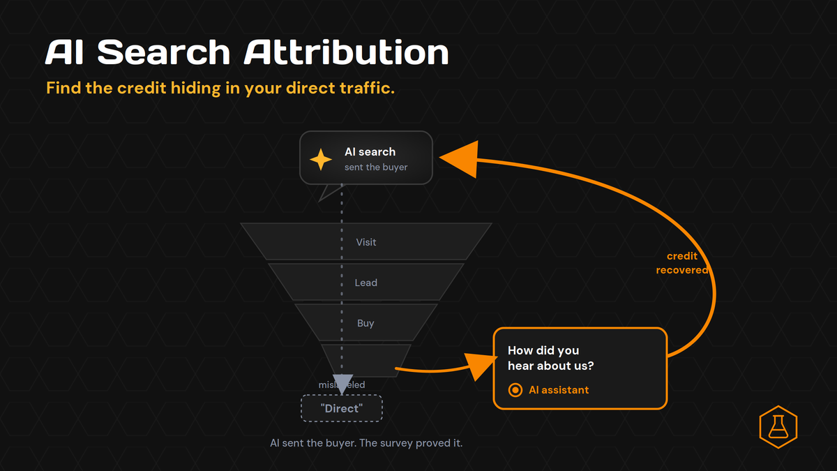
How to Solve the AI Search Attribution Funnel
Your AI search work is paying off. People are finding you in ChatGPT and Perplexity, your brand shows up in the answers, and demand feels warmer than it did last year. Then you open your analytics. The channel that grew is “Direct.” The report says AI sent you almost nothing. That gap is not a traffic problem. It is an
July 2, 2026
SEO Isn’t Dead. The Unit Just Changed.
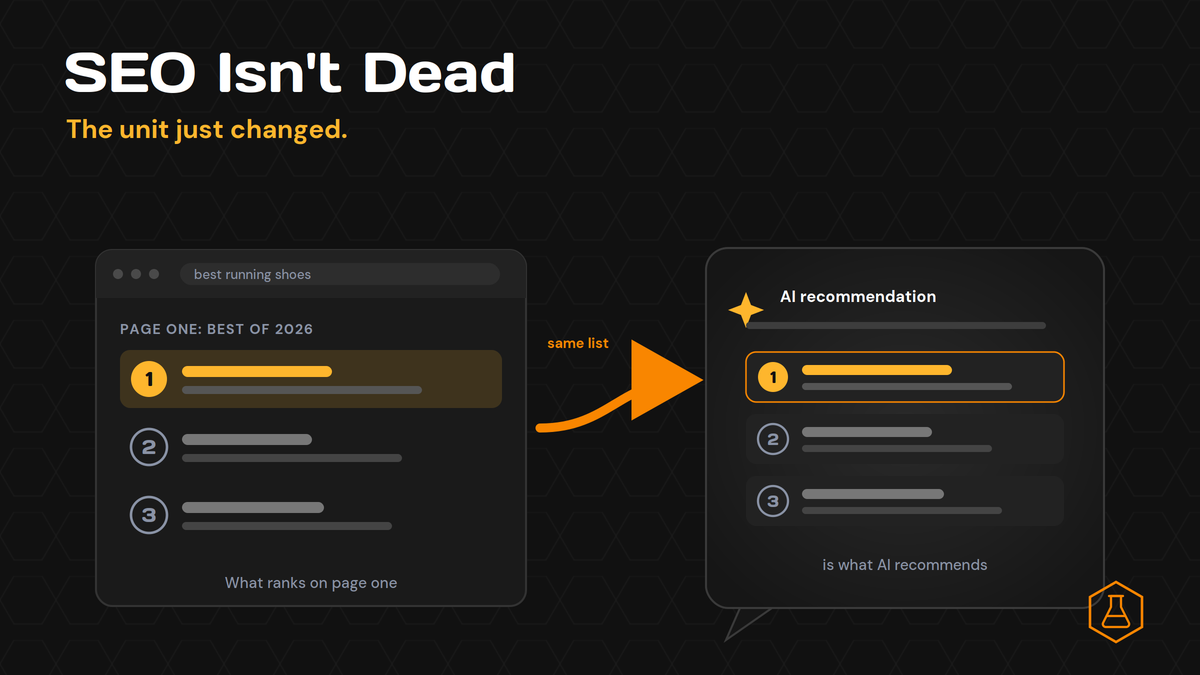
Every quarter someone declares SEO dead. This year AI search is holding the knife. The logic sounds clean: if ChatGPT and Perplexity answer the question, nobody clicks a blue link, so why rank at all? We wanted a real answer, not a hot take. So we ran the test. We sent 8 buyer-style “best tool” questions through Perplexity and logged
June 29, 2026
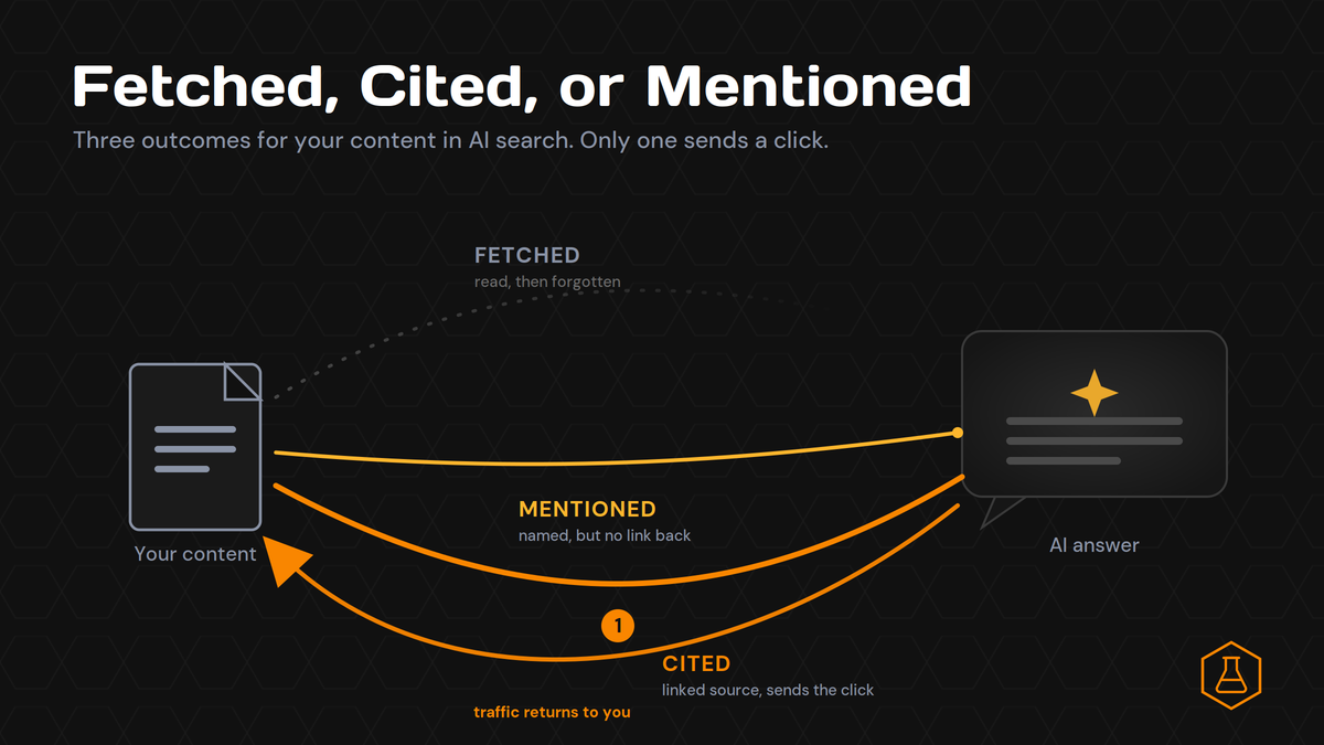
Fetched, Cited, or Mentioned: The 3 Ways AI Uses Your Content
You ran the test every marketer runs now. You asked ChatGPT about your category, watched your brand name show up in the answer, and felt good for about ten seconds. Then you checked your traffic. Nothing moved. Here is the part nobody explains. A mention is not a citation. And a citation is not the same as the page that
June 26, 2026
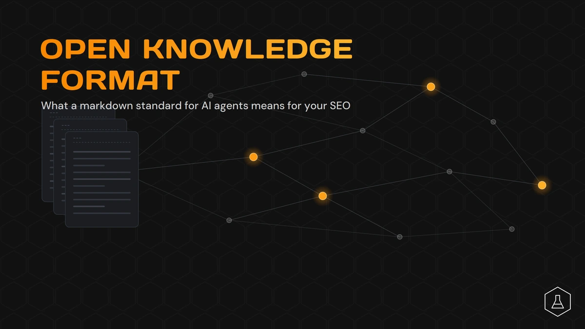
Open Knowledge Format: What It Means for SEO
Google just shipped the Open Knowledge Format, and the SEO world is split on what to do with it. Some say it’s the next big thing for AI search. Others say it has nothing to do with your rankings. Both camps are partly right. Here’s the short version. Open Knowledge Format (OKF) is a way to package your business knowledge so
June 23, 2026
Contact us
We value your privacy and won't share your email with others.
We'll only contact you with curated content.